Storyline 3: Responsive Player FAQs
Article Last Updated
This article applies to:
The all-new responsive player for Storyline 3 gives learners the best viewing experience on tablets and smartphones, regardless of screen size and orientation. See these FAQs for answers to common questions about the responsive player.
- How does the responsive player work?
- How does Articulate's responsive player compare to Adobe Captivate's responsive authoring?
- Does the new responsive player replace the current standard player?
- Does the responsive player support the same features as the standard player?
- Where is the seekbar on the responsive player?
- Can I enable and disable features on the responsive player?
- How does the responsive player behave if I disable all the player features?
- Can I change the colors, font, and font size for the responsive player?
- Will e-learning courses with the responsive player track progress and results in my LMS?
- Does the responsive player support touchscreen gestures?
How does the responsive player work?
The all-new responsive player automatically displays when you view Storyline 3 HTML5 courses on tablets and smartphones. It fluidly responds to the screen size and orientation of any mobile device for the best viewing experience, hiding sidebar menus, eliminating browser chrome, and delivering mobile-friendly playback controls. No extra work required. Just publish your course and let the player do all the work for you.
When you view the same courses on desktop and laptop computers, the standard player will be used.

How does Articulate's responsive player compare to Adobe Captivate's responsive authoring?
Captivate’s responsive solution requires course authors to tweak slides for every device learners use, which is difficult, tedious, and cumbersome. You end up building the same course over and over.
In contrast, our responsive player doesn’t require any extra work. We believe technology, not course authors, should do the heavy lifting. So you just build your course like you normally would and publish. The responsive player optimizes the experience for every device your learners use. In short, you don’t do a thing—a dramatic contrast to Adobe’s approach.
See these resources for more information on mult-device e-learning:
- Article: Comparing Articulate's Responsive Player with Adobe Captivate’s Responsive Solution
- White Paper: Delivering E-Learning in a Mobile World
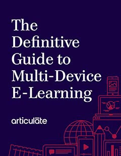
- E-Book: The Definitive Guide to Multi-Device E-Learning
Does the new responsive player replace the current standard player?
On mobile devices, yes. When you view a Storyline 3 course on a desktop or laptop computer, it'll use the standard player. However, when you view the same course as HTML5 output on a tablet or smartphone, it’ll automatically use the new responsive player. You don't have to do anything. The player will do all the work for you.
Does the responsive player support the same features as the standard player?
The responsive player supports most of the standard player features, but there are a few differences. For example, the player colors aren't currently supported in the responsive player. See this interactive demo for details.
Where is the seekbar on the responsive player?
When your tablet or smartphone is in landscape mode, the responsive player moves to the right side of the screen. As the slide plays, you’ll see a circular indicator travelling around the play/pause button. You can’t scrub back and forth along the seekbar in landscape mode, but the circular indicator lets you see how much time has elapsed and how much remains.
To make the seekbar interactive, just turn your tablet or smartphone to portrait orientation. The responsive player will move to the bottom of the screen and reveal a horizontal seekbar that you can drag back and forth.
Can I enable and disable features on the responsive player?
Yes. The same player properties window in Storyline 3 controls both the standard player and the responsive player, so you can enable/disable any player feature. See this user guide to learn how.
How does the responsive player behave if I disable all the player features?
The responsive player, like the standard player, will only display features you’ve enabled in the player properties for your course.
If you disable all player features, the responsive player will disappear.
Can I change the colors, font, and font size for the responsive player?
Currently, the colors, font, and font size options only apply to the standard player, not the responsive player.
Will e-learning courses with the responsive player track progress and results in my LMS?
Yes. The responsive player only affects how the player is displayed. It doesn't impact LMS tracking.
The content will still track progress and results in AICC, SCORM, and xAPI (Tin Can API) learning management systems. Learners can even switch between their tablets/smartphones and their desktop/laptop computers in the middle of a course, and it'll still track properly in your LMS.
Does the responsive player support touchscreen gestures?
Yes. We’ve optimized the new responsive player for touch control. It supports touchscreen gestures—such as swiping, dragging, and pinch-to-zoom—in HTML5 output on tablets and smartphones. See this article for details.


