Storyline 360: Modern Player Accessible Contrast
Article Last Updated
This article applies to:
Accessible content is more than just a nice-to-have, it’s a necessity.
As part of our ongoing commitment to making courses fully accessible to everyone, the modern player in Storyline 360 now meets and exceeds WCAG Level AA guidelines for visual contrast and color. With the March 2021 update, it’s easier for all learners to read text, decipher icons, perceive interactions, and navigate content.
This feature is turned on by default in new and existing projects that use the modern player. Just install Storyline 360 build 3.50.24668.0 or later and let it do the heavy lifting for you!
Note: This update doesn’t change any functionality of the modern player. It increases the contrast on player elements, so they adhere to accessibility guidelines.
Read on to learn the benefits.
Enhanced Contrast
Previously, some elements of the modern player interface had insufficient color contrast, which created barriers for people with a visual impairment. For example, someone with a color deficiency might not see subtle color changes and therefore miss key information.
Now, all controls and icons of the dark and light themes have optimal contrast, resulting in an inclusive interface that’s easier to see.
Curious about which player icons and buttons have enhanced contrast? Examples include:
- Player tab options (e.g., Menu, Glossary, Notes, Resources)
- Player controls (e.g., Volume, Search, Captions, Seekbar, Play/Pause, Accessibility Controls, Scroll bar)
- Navigation buttons (e.g., Prev/Next, Submit)
Check out these before-and-after screenshots. (Click the images to enlarge them.)
|
Before |
After |
 Dark Theme | 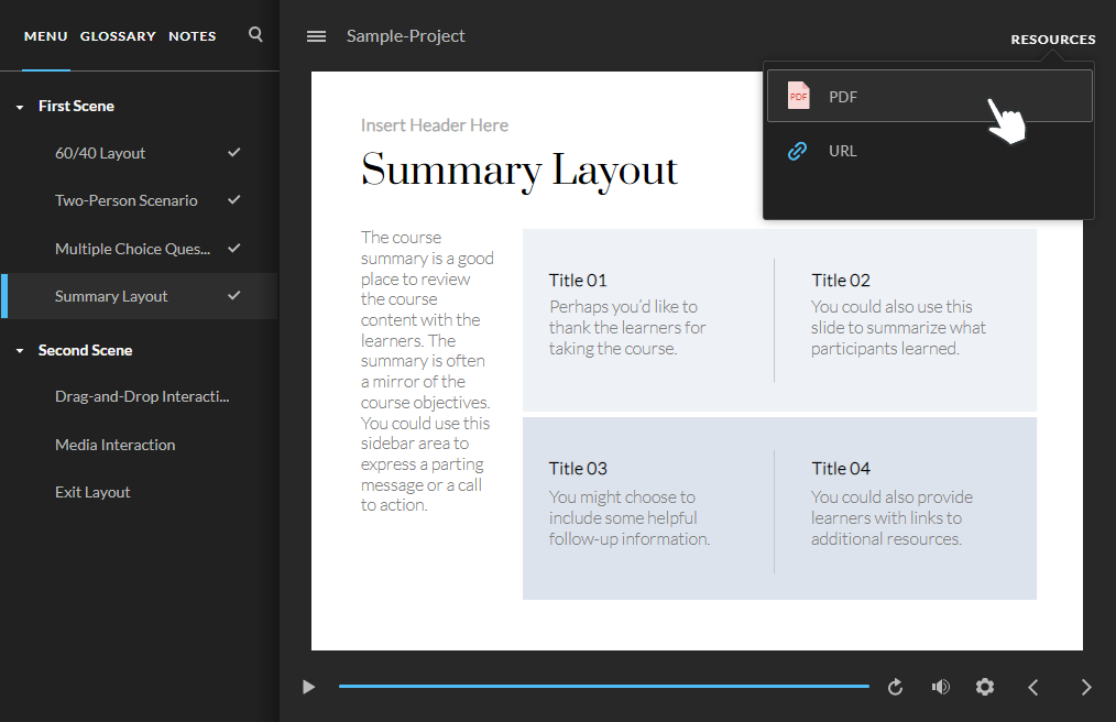 Dark Theme |
 Light Theme |  Light Theme |
Meaningful Communication
Information should be empowering, not overwhelming.
With that philosophy in mind, we updated the modern player to clearly convey all player states and status changes to learners and screen readers. As a result, it’s easier for all learners to identify the state of each player element and always know their progress in your course—without relying on color alone.
Here’s what to expect:
Selected Slide Indicator
A rectangle appears to the left of the slide title in the menu for the selected slide, indicating which slide the learner is currently on.

Check Mark and Lock Icons
Check mark icons appear to the right of the slide title in the menu for selected and visited slides, informing learners of their progress.
Lock icons next to slide titles display when your course has navigation restrictions, guiding learners along the way.
For restricted menu navigation, learners see this lock icon for slides they haven’t yet reached:
For locked menu navigation, learners see the lock icon as shown above for slides they haven’t yet reached, as well as this visited lock icon for slides they previously viewed:
No matter the menu navigation type—free, restricted, or locked—learners see the check mark icon for selected and visited slides.
Active State Indicator
When the closed captioning button is enabled, it’ll be underlined in your chosen accent color, making it easier to perceive its state.

Hover Border
A border appears when hovering over slide titles and resources, helping learners stay focused.
Selected Tab Indicator
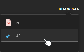
A line is visible below the selected sidebar tab, making it more explicit for learners to see which tab they’re on.

Note: The selected tab indicator won’t show for topbar tabs.
Adjustable Volume Bars
The sound waves of the volume button instantly update to reflect the selected level, resulting in greater control and visuals of volume levels.
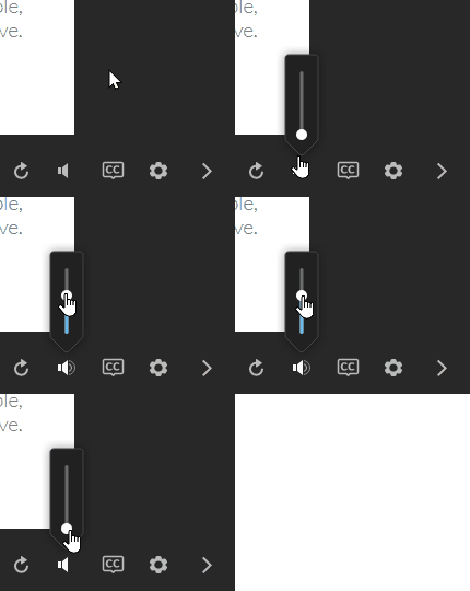
Pro Tip: The color of some player elements—such as the selected slide indicator, selected tab indicator, and the volume controller—is based on the accent color you set in your player properties.

To learn how to customize the modern player, visit Choose Colors, Fonts, and Button Styles for the Modern Player.
Distinct Visual Cues
When you don’t depend on color alone to convey information, your content becomes more accessible for everyone.
The modern player now uses icons and other visual elements like those described above, giving people with low vision or color deficiency more options to scan and perceive content.
This feature also improves the accessibility of your courses for learners who view them in direct sunlight or who enable warmer screen colors, which can cause colors to become less discernible.
Compatibility
The modern player is exclusive to Storyline 360.
If you open Storyline 360 project files that use the modern player in Storyline 3, players will return to the classic style and default color scheme. Additionally, players will continue to use the classic player if you later reopen those projects in Storyline 360.
To learn more about compatibility, visit this article.
